Reduce Form Abandonment Rates for Better Lead Generation

As you kick off the new year planning your campaigns, here's a heads-up: don't overlook the silent culprit that might be costing you potential leads - form abandonment.
Forms provide the entry point for leads to engage with your business and potentially become valued customers. Yet only a fraction of these leads complete the process. The key lies not just in grabbing attention, but optimising your forms to encourage user engagement.
Why Form Abandonment Matters
Nearly 70% of users will abandon online forms. This results in missed opportunities and revenue. Every incomplete form represents a missed chance to capture a new lead. This directly impacts your bottom line, as retaining more leads creates more opportunities for conversion and revenue.
Complicated or frustrating forms also lead to poor user experience, leaving a negative brand impression. Tackling form abandonment goes beyond capturing leads, it's about crafting a positive brand image and satisfactory user journey.
Top Reasons Forms Get Abandoned

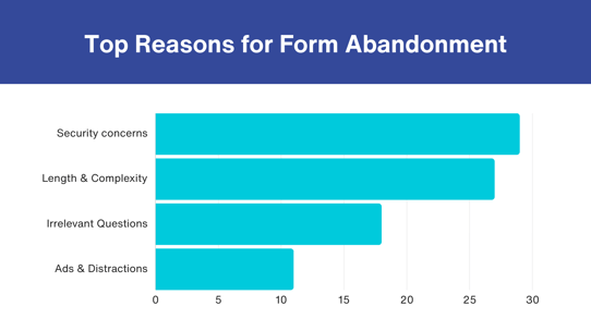
To effectively address form abandonment, you need to understand why it happens. Here are some of the most common culprits.
Lengthy and Complex Forms
Length and complexity strongly correlate with abandonment rates. They overwhelm users, causing frustration and drop-offs. Imagine filling out numerous fields of data! No one wants to do that. Additionally, every added section drives a cumulative 10% drop-off. Simply put, long forms equal lost leads. Reducing the number of required entries can significantly improve completion rates.
Confusing Design and Lack of Clarity
Unclear navigation paths and complex designs leave users confused. When users can't discern where to click or how to proceed, they're likely to abandon the form. Maintaining clear, intuitive design eliminates confusion, guiding users smoothly through your forms.
Failing to Communicate Value or Irrelevant Questions
30% of users will complete filling out an online form if they can get something in return. If your form fails to communicate the value they'll receive or if questions seem irrelevant, users are likely to abandon ship. Webinars, whitepapers, ebooks, free trials, and product demos are the most sought-after gated content on registration forms.
Users are cautious about offering personal information. Rather than asking for unnecessary details, focus on collecting essential data directly related to the immediate value you're offering. For instance, asking only for an email to deliver an ebook ensures a balance between user trust and data collection.
Friction from Forced Account Sign-ups and Other Distractions
Forcing users into creating accounts or bombarding them with unnecessary distractions such as ads introduces friction. 23% of users will not fill out a checkout form if they are asked to create a user account. Make sign-ups optional and consider providing incentives such as discounts or additional credits in a subscription for users who opt to create an account.
3 Solutions for Reducing Form Drop-Off
1. Shorten Your Forms
Shortening forms is not just about reducing fields; it's about catering to the modern user's desire for quick results and easy interactions. Stick to essential fields, encouraging users to complete your form.
Consider implementing a progressive profiling strategy where you collect information gradually over multiple interactions. This reduces the initial demand on users, making them more likely to engage and complete the form.
2. Show Users What’s In It For Them
Understanding the user's perspective is crucial. Highlight the value users gain by completing the form. Whether it's exclusive content or transparent data usage, clearly communicate the benefits to increase user motivation and completion rates.
3. Help Users Complete Fields
Implement autocomplete functions to assist users in correcting terminology, avoiding typos, and refining their search. This not only reduces user effort but also ensures accurate and complete data entry. If it’s a returning user, provide dynamic suggestions helping users them choose from pre-existing options.
Quick win: Address Validation
Address validation goes beyond accuracy; it improves user experience by displaying results in real-time and autofilling form fields with address details. Accurate addresses ensure that the business holds the right data to continue offering good customer service.
How Ideal Postcodes Helps You Resolve Form Abandonment
Ideal Postcodes is the most trusted address validation service with deep expertise in UK and global address data. Our address finder is the fastest on the market, showing results in as little as 45 seconds. Moreover, we prioritise inclusivity with a screen reader for visual disabilities, ensuring a seamless experience for all users.
Ready to take action? Sign up for a free trial and improve form completion rates.
